


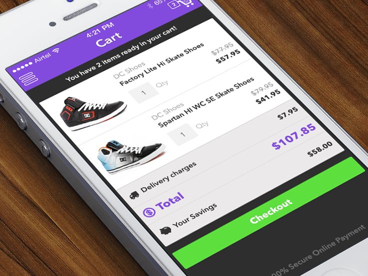
The following is familiar to you: you will receive a discount code in your e-mail. You open it on your mobile and click through to the webshop. While you make a cup of coffee, you want to order quickly, because: discount! However, navigating to your favorite product is a crime. Loading photos takes forever. And also the address fields do not make it easy for you. In the meantime your coffee is ready, you put your mobile away. This is just an example of (in this case bad) user experience on mobile, which with the mobile-first indexing update only becomes more important.
User experience on mobile
The webshop in question tried it well, but the discount campaign did not deliver a (satisfied) customer. A sin of the efforts. Unfortunately, a step backward in usability on mobile is the rule rather than the exception. In this article, you can read why the user experience on mobile should get your attention. Followed by 5 tips for a user-friendly (er) mobile website.
Mobile first indexing and the importance of a mobile website
Mobile traffic (via smartphone, tablet or similar) to websites is exceeding desktop traffic worldwide. That is why the search engine is rolling out the long-awaited update for mobile-first indexing. This means that Google will show the mobile web pages in the search results. Even if you search via desktop. Non-mobile websites will still be indexed, but it will be more difficult to make them rank high. So – Mobile first.
If your website is responsive, you will not have to worry about the impact of this update on your rankings. The mobile version and the desktop version have the same content (value). But do you have a separate mobile version of your website, does it contain less content than on the desktop version and do you have online ambitions? Then you will have to take action.
Even if you already have a responsive theme, you can not sit back. With a view to the future and the many mobile visits, it is advisable to take a critical look at the user experience of your mobile website.
Everything revolves around the user
The updates from Google are not there to link webmasters, SEO professionals and/or marketers. It is simply Google’s mission to provide the searching internet user with the most relevant information. So everything revolves around the user and his experience. In other words, the user experience.
Do you want to get started and let your visitor do what you want on your website? Below I give you 5 tips to give your mobile visitor a top time on your site. Maybe they are familiar to you, because they also apply to the desktop. Nevertheless, it is good to read them carefully in the context of a mobile website. This is completely differently used by your visitor.
5 tips for a user-friendly mobile website
1. Do not start with designs right away
It is tempting to start directly with design, but I want to advise you to start with something else. Namely: research. I know, much less sexy than design. But without knowing who your visitor is and what they now expect from your website, you can not design anything for them. You are not your user. User centered design, therefore, starts with research first.
For example, you think you should offer the same content on mobile as on the header, in the same order. But it turns out that your visitors only want to look up the contact details of your company via mobile. It is not said that you only have to design a contact page, but you can give it a distinctive (re) place than you initially thought.
2. Set priorities
We want to go fast via mobile. Faster than quickly. As mobile internet users, we use our devices at crucial moments and only for short periods. Our experiences must, therefore, be personalized, efficient and enjoyable to keep us really involved and continue to use sites.
One of the biggest pitfalls of a mobile-friendly site is, therefore, to present everything to your visitor. Services or products, shoulder patches in the form of reviews or portfolios, cross-selling or up-selling temptations, promotion of social channels, an offer, and so on. Remember that the mobile visitor is (very!) Impatient and wants to accomplish a task. So make sure that is possible and do not distract it: set priorities.

A sticky contact form icon .
3. Consider how a device is used and make it easy
A telephone is usually held in one hand and operated with the thumb. The larger the copy, the harder it is to touch the upper part of the screen. And let that be the place where most websites place their navigation.
If you ask for a credit card number, make sure you have a dynamic keyboard that only shows numbers for that field. And selection fields or checkboxes are easier than input fields.
These are just a few examples. By carefully thinking about using your site on a mobile, you can better serve your visitor and keep him involved.
4. Copywriting for mobile website
Reading a screen is already a task, a small screen makes the challenge even bigger. A sentence that covers one-and-a-half lines on the top of a cell is soon a ‘piece of text’ of four lines. That means more scrolling and thinking, while reading.
Mobile visitors often also read your content on the road or they do something else in the meantime. Copywriting for mobile must, therefore, be easily ‘digestible’ to keep visitors involved. Also, think of a nice font that is easy to read.
5. Do not let them wait
You also recognize this: you try to visit a site, but it takes so long (more than three seconds …) that you have clicked your browser and opened Facebook / Instagram / mail. The speed of your website is an issue. The speed of your mobile website is top priority. Mobile visitors are even more impatient if possible. A slow loading time and dead-end pages are therefore unthinkable. Slow mobile websites will also be disadvantaged by Google from July 2018 .
And Pingdom’s research shows what the relationship between loading time and bounce rate is.
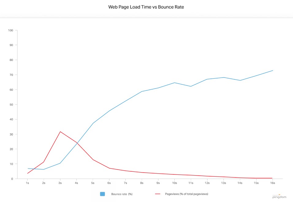
Loading time of pages versus the bounce rate (Pingdom).
Look critically at the user experience of your mobile site
Websites are visited more often via mobile than via desktop. And thanks to the mobile-first indexing update from Google, you can not do without a mobile website – especially if you want to continue to rank. If you also want to convert that traffic into conversion, a good user experience on mobile is a must. This applies to newly built websites, but also to responsive themes.
Realize that a mobile website is completely different from a desktop version, simply because it is used differently by your visitor. If you want to continue to rule online, take a critical look at the user experience of your mobile site.
Tip: do you want to know how user-friendly your website is for mobile visitors? Use the free mobile-friendly test from Google to get an idea.


Add Comment